Most loyalty programs are over-measured and under-understood. The dashboard has dozens of metrics. The monthly report runs ten pages. And when leadership asks “is the program working,” the team has to think carefully about which numbers actually answer the question.
This piece is a complete KPI framework for loyalty programs: the five categories of metrics that matter, the specific KPIs in each, how to prioritize them by program maturity, and how to turn the framework into a scorecard that leadership can read.
The Five Categories
A useful KPI framework for loyalty groups metrics into five categories, in roughly the order in which a program should care about them.
Enrollment health. Are members joining at a rate that supports the program’s goals?
Engagement depth. Once enrolled, are members actually using the program?
Behavioral impact. Is membership changing what people do — visit more, spend more, retain longer?
Financial return. Does the math work? Is the program producing more value than it costs?
Program economics. Are the underlying liabilities, costs, and structural metrics healthy?
Each category answers a different question. Programs that only measure one or two are flying with most of the instrument panel covered.
Enrollment Health Metrics
Enrollment rate. The percentage of identifiable repeat customers who are members. Useful for tracking growth and identifying channels where enrollment is weaker than expected.
New enrollment trend. Net new enrollments per period, broken down by channel and campaign source. Useful for evaluating enrollment investment.
Time-to-first-transaction. How long after enrollment does the new member transact again? A short time-to-first signals that the program is delivering on its enrollment promise.
Enrollment-to-active conversion. What percentage of new enrollments become active members within a defined window. The single best leading indicator of long-term program health.
Engagement Depth Metrics
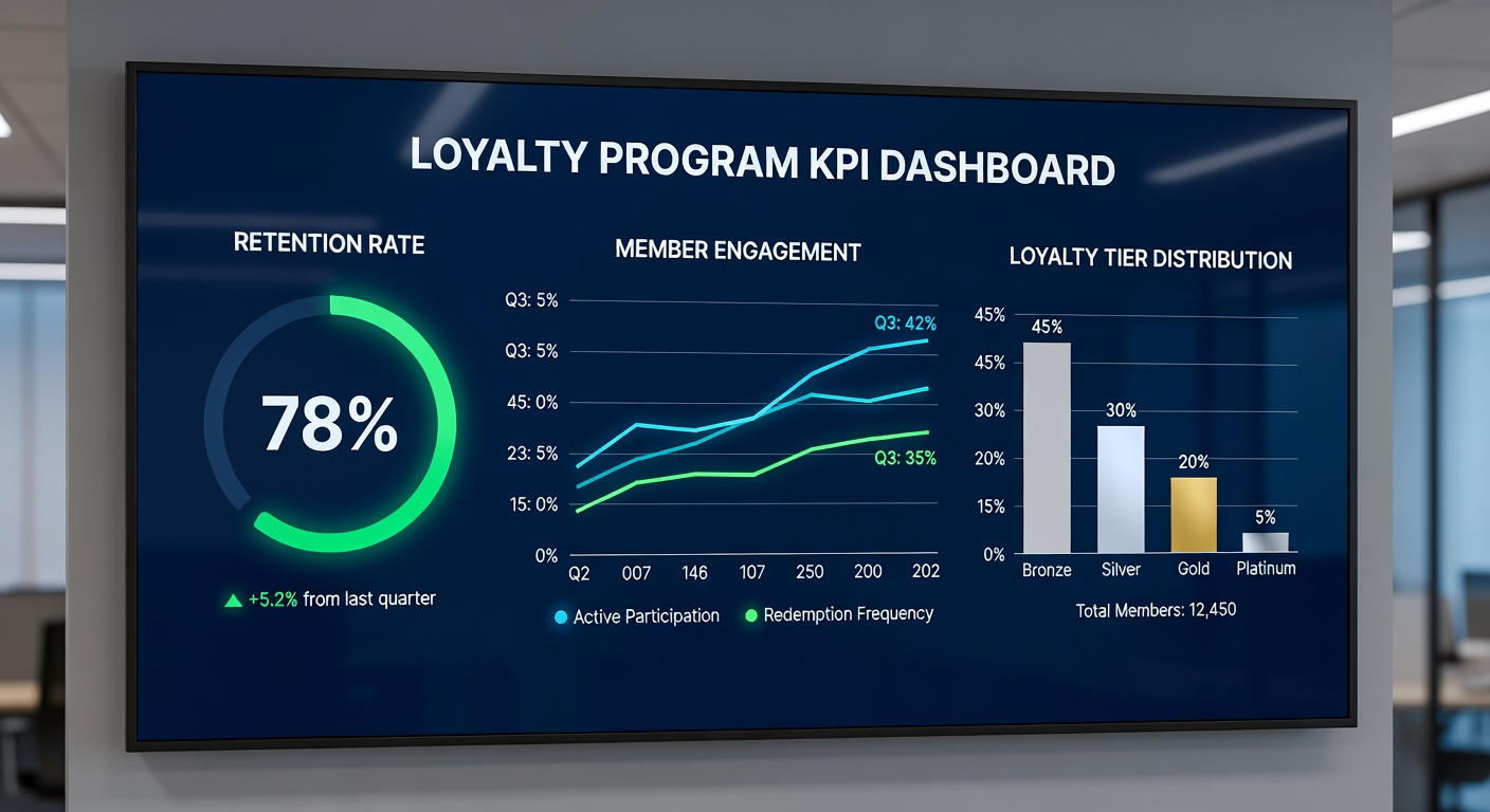
Active member rate. Percentage of enrolled members who transacted in the relevant window. The headline engagement metric.
Engagement frequency. Average transactions per active member per period. Tracks whether the active base is becoming more engaged or less.
Email engagement. Open rate, click rate, and unsubscribe rate for loyalty communications. Tracks the health of the relationship between the program and the member.
App engagement. Where the program has a mobile app, monthly active app users, sessions per active user, and feature engagement.
Redemption rate. Percentage of issued rewards that get used. A leading indicator of program disengagement when it falls.
First-redemption rate. Percentage of new members who successfully redeem their first reward within a defined window. The single best predictor of long-term engagement.
Behavioral Impact Metrics
Visit frequency lift. Difference in visit frequency between matched active members and non-members. The most important behavioral metric for any frequency-driven category.
Check size differential. Difference in average transaction size between active members and non-members.
Category penetration. Whether members are buying across more of the brand’s categories than non-members.
Member retention. What percentage of members are still active 12 months after enrollment, 24 months, 36 months. The retention curve over time is the truest test of program durability.
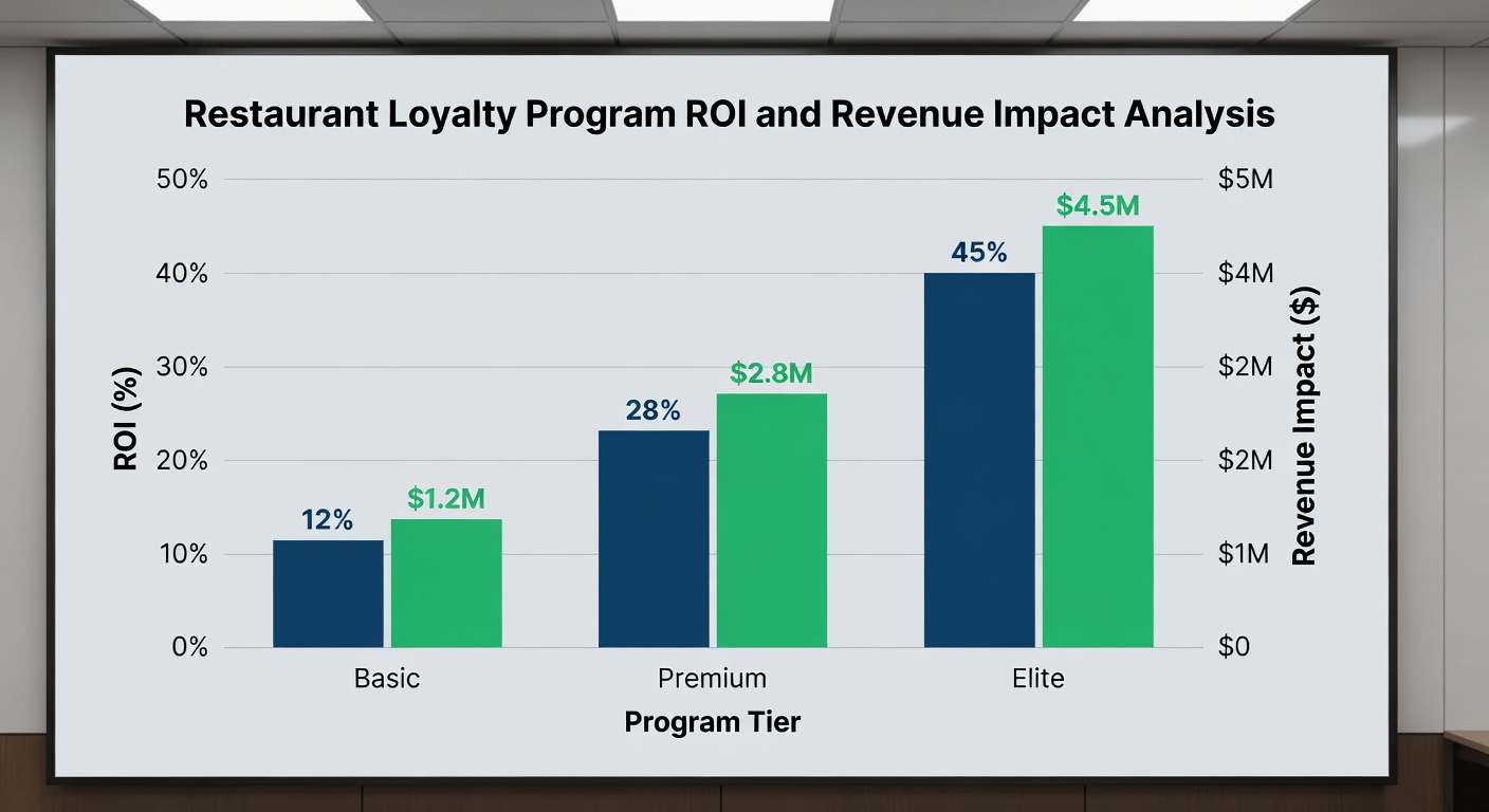
Financial Return Metrics
Program-attributed revenue. The portion of revenue that can be reasonably attributed to the program, using matched-pair analysis.
Member lifetime value vs. non-member. Comparing the long-run economic value of members against comparable non-members.
Program ROI. Total program-attributed value (revenue impact + retention impact + data value) against fully-loaded program costs.
Cost per active member. Total program cost divided by active members. A useful efficiency metric over time.
Program Economics Metrics
Points liability. Total dollar value of outstanding points or rewards on the balance sheet.
Breakage rate. Percentage of issued points that are never redeemed. Should be modeled, not hoped for.
Liability-to-active ratio. Liability per active member. Watches for liability building up faster than active engagement.
Cost-of-rewards as a percentage of program-attributed revenue. A core program-economics ratio. Trends matter more than absolute levels.
How to Prioritize by Program Maturity
The same metrics matter for every program, but the prioritization changes meaningfully by stage.
Year 1 — launch stage. Focus on enrollment-to-active conversion, first-redemption rate, and time-to-first-transaction. These metrics tell you whether the program is delivering its promise. Aggregate enrollment numbers are less important than the conversion to engagement.
Years 2-3 — growth stage. Focus shifts to active member rate, redemption rate, and visit frequency lift. The question moves from “are we onboarding members well” to “is the program changing behavior.”
Years 4+ — maturity stage. Focus shifts to retention curves, member lifetime value, and program economics. The question moves to “is the program a durable competitive asset and is the math working long-term.”
Programs that try to focus on year-4 metrics in year 1 misallocate attention and miss the leading indicators that would have warned them about engagement problems early.
Vanity vs. Actionable Metrics
A useful filter for any loyalty metric is whether it is actionable. Three tests:
Does the metric move based on something we control? Vanity metrics often move with macro conditions or marketing activity outside the program.
Does a meaningful change in the metric trigger a specific decision? If a 10% drop in the metric wouldn’t change anything operationally, it isn’t a useful metric for the loyalty team to track.
Can the metric be reproduced cleanly? Metrics that require heavy estimation or rotating definitions are unreliable for decision-making over time.
Common vanity metrics: total enrollments (without active rate alongside), gross member spend (without matched-pair comparison), email opens by members (without conversion to behavior).
Reporting Cadence and Governance
A useful reporting cadence has three layers:
Operational dashboards — refreshed daily or weekly, used by the loyalty team to spot issues quickly. Cover enrollment, active rate, redemption, and campaign performance.
Monthly business review — used by the loyalty leadership team and adjacent functions. Covers the engagement, behavioral impact, and program economics layers.
Quarterly leadership scorecard — used to communicate program health to executive leadership. Three to five top-line metrics, with trend lines and brief narrative.
The mistake most teams make is collapsing all three layers into a single monolithic report. Each audience needs different metrics at different cadences.
Building a Loyalty Scorecard for Leadership
A leadership scorecard should answer three questions in a single page:
Is the program healthy? Active member rate and first-redemption rate, with trend lines.
Is the program changing behavior? Visit frequency lift and member retention curve, against a non-member baseline.
Is the program economic? Program ROI and cost-of-rewards as a percentage of program-attributed revenue, with the underlying liability noted.
Three questions, six numbers, trend lines. Leadership can absorb that. They cannot absorb forty.
Using KPIs to Make Decisions
The point of measurement is decisions. A few examples of how KPIs should drive specific actions:
A falling first-redemption rate triggers a review of the path to first reward.
A growing gap between enrollment and active rate triggers a review of post-enrollment communications and early-engagement design.
A flat or declining visit frequency lift triggers a review of program relevance — is the program still delivering meaningful incremental motivation, or has it become wallpaper?
A rising liability-to-active ratio triggers a review of points economics and expiration policy.
Programs that watch the metrics and don’t act on them are gathering data, not managing a program.
FAQ
How many KPIs should a loyalty program track in total? Operationally, fifteen to twenty-five is a reasonable range. For leadership reporting, three to five top-line metrics. Beyond that, attention thins out.
Should the loyalty team own all of these metrics, or share with finance? The financial return and program economics metrics typically benefit from co-ownership with finance. The other categories belong to the loyalty team.
How do we handle attribution without a perfect matched-pair design? With humility. Use the best matched-pair logic available, acknowledge the limitations, and triangulate with controlled tests where possible. Honest imperfect attribution is more useful than confident bad attribution.
What’s the most overlooked KPI? Cohort retention curve — what percentage of members enrolled in a given month are still active at 30, 90, 180, and 365 days. It is the metric that reveals whether the program is getting better or worse at the relationship over time.
The Strategic Takeaway
The right measurement framework is not about more metrics — it is about the right ones, organized into the categories that map to decisions. Programs that build their scorecard around enrollment health, engagement depth, behavioral impact, financial return, and program economics — at the appropriate cadences for each audience — tend to manage themselves more effectively and tell a clearer story to leadership. Programs that ship a forty-metric dashboard and hope leadership finds the signal are doing measurement theater, not management.
Further Reading from Authoritative Sources
- Association of National Advertisers — ANA publishes loyalty marketing measurement standards and KPI frameworks that provide the industry benchmark context for the five-category measurement model and leadership scorecard design described in this guide.
- Harvard Business Review — HBR’s research on measurement discipline and marketing analytics underpins the guide’s distinction between actionable metrics and vanity metrics, and the matched-pair attribution methodology required to measure true behavioral impact.