The gap between restaurant loyalty apps that drive ongoing engagement and those that quietly die in the App Store has less to do with the underlying loyalty mechanics than with the design choices made in the customer-facing app itself. The same points program, run with two different app experiences, produces meaningfully different participation rates. The mechanics define what is possible; the design defines what actually happens.
This piece examines the UX principles that consistently separate high-engagement restaurant loyalty apps from the broad middle of the category.
The Enrollment Funnel
The single highest-leverage area in any loyalty app is the enrollment flow. The drop-off rate between a customer downloading the app and successfully completing first sign-in is a primary determinant of program participation, and small friction changes produce large engagement differences over the life of the program.
Strong enrollment flows do four things consistently.
They reduce required fields to the minimum that the program legitimately needs. Asking for full address, birthdate, and phone number on the first screen — when only email and name are technically required for enrollment — turns abandonment up sharply. The information can be collected later, prompted at moments when the customer has reason to share it.
They support social and single-tap authentication options. Sign in with Apple, Sign in with Google, and similar mechanics dramatically lower the friction of account creation, especially for customers who do not want to invent another password.
They offer an immediate, tangible reward for completing enrollment. “Get a free drink for joining” performs better than “Welcome to our rewards program,” because the value is concrete and the customer’s next visit becomes the redemption moment.
They preserve the flow when the customer is interrupted. A customer who starts enrollment but gets pulled away should be able to resume where they left off rather than restarting. Email verification flows that interrupt the funnel and lose context are a common cause of abandonment.
Home Screen Hierarchy
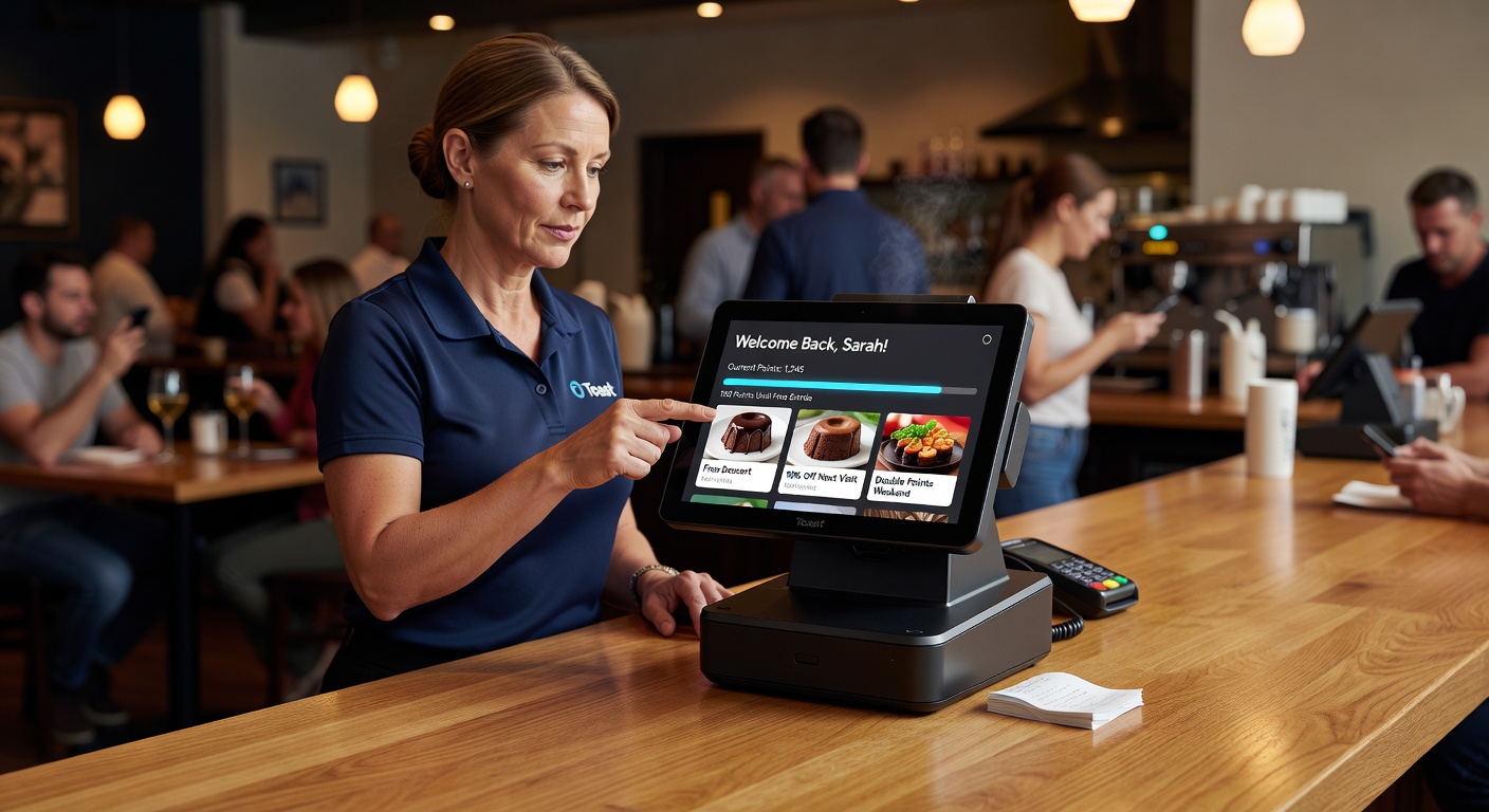
When a customer opens the app, what they see first determines whether the app is doing its job. High-engagement loyalty apps make the answers to three questions visible without scrolling: what is my current status, what is the next thing I can do, and what is the most relevant offer right now.
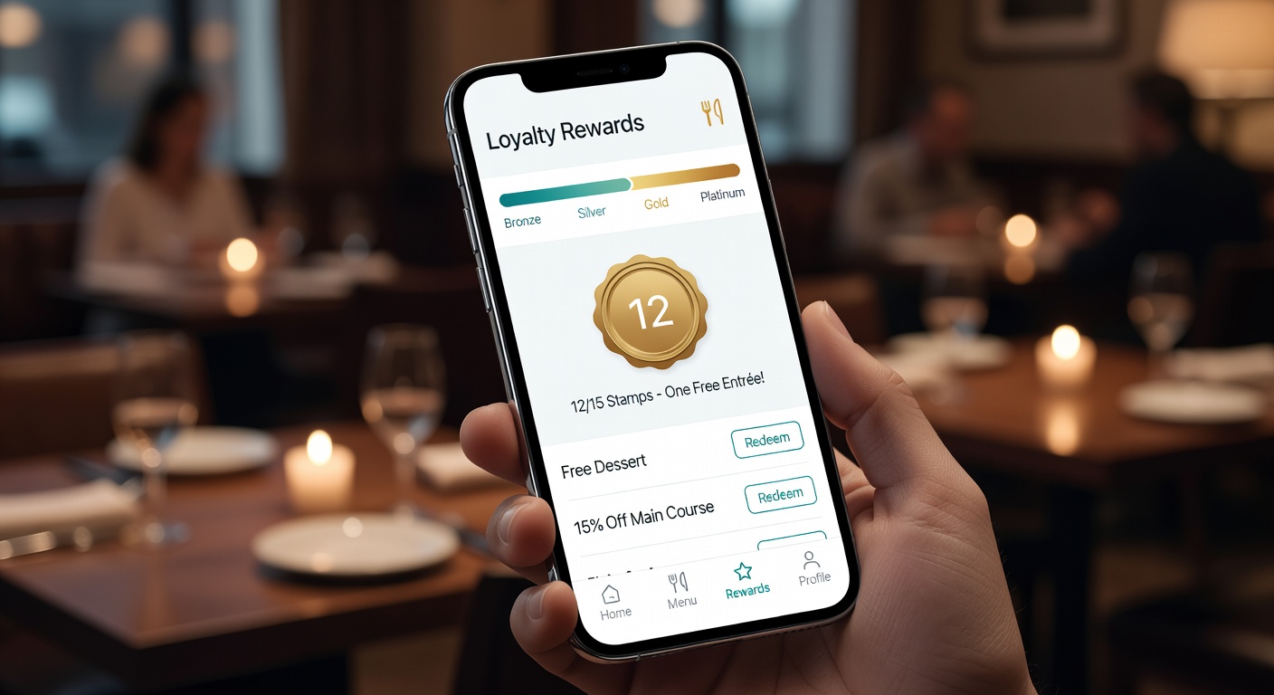
Current status. Points balance, reward progress, and tier status should be visible on the home screen. Customers who have to navigate to find their balance use the app less than customers who see it on open.
Next action. The most useful element on many home screens is a progress indicator toward the next reward — “two more visits until your free entrée” — paired with a clear path to the action that closes the gap. Progress signals turn passive balance views into active engagement.
Most relevant offer. A single featured offer, surfaced based on the customer’s history and current context, generally outperforms a list of all available offers. The list belongs on a secondary screen for customers who want to browse.
The home screens that consistently underperform are the ones that try to present everything — recent transactions, full offer catalog, news, location finder, settings — at once. The result is visual overwhelm and lower engagement on every individual element.
Gamification That Works
Gamification is one of the most overused and most under-thought-through ideas in loyalty app design. The mechanics that consistently work and the ones that consistently fail can be distinguished by a clear principle: the game should reinforce the real behavior the program wants, not substitute for it.
Mechanics that work include visible progress bars toward concrete rewards, status tiers that unlock real benefits, streak counters tied to visit frequency, and surprise-and-delight bonus rewards that arrive unexpectedly. These mechanics make the underlying program more visible and more emotionally engaging without changing what the program is rewarding.
Mechanics that fail include points-for-points-sake systems disconnected from real rewards, leaderboards that pit customers against each other in ways no one actually wants, complex achievement systems that customers cannot navigate, and arbitrary badges with no practical value. These mechanics feel gimmicky because they are — and customers correctly identify them as marketing decoration rather than meaningful value.
The simplest test of a gamification feature is whether the customer would notice if it were removed. If the mechanic adds nothing the customer would miss, it adds nothing the program needs.
Notification Strategy
Push notifications are the most direct re-engagement channel a loyalty app has and the easiest to ruin. The default tendency is to over-notify, and the predictable result is notification opt-outs that close off the channel permanently.
A reasonable notification strategy follows several principles. Notifications should be relevant to the individual customer rather than blasted to the whole list. They should have a clear purpose — earned reward available, expiring offer, status change, new menu item the customer is likely to care about — not generic engagement nudges. They should respect time of day and time zone. They should be infrequent enough that each one is welcome rather than annoying.
Operators who get notification strategy right typically send fewer than ten push notifications per customer per month, with the most engaged customers sometimes seeing more and the least engaged seeing fewer. Frequency tuning based on customer responsiveness is a marker of mature programs.
Redemption Flow
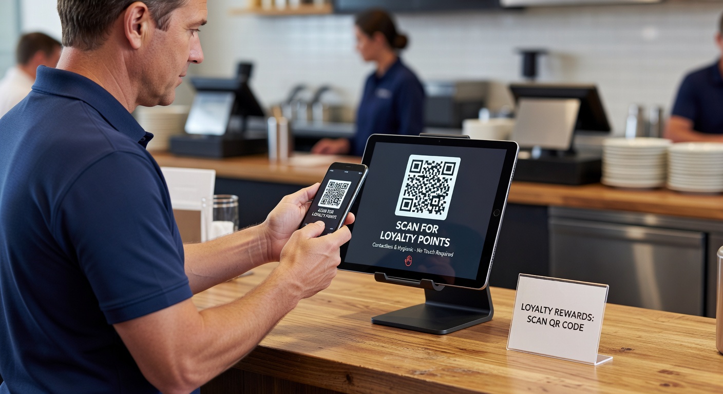
The moment of redemption is where loyalty apps either confirm their value or break trust. A well-designed redemption flow accomplishes three things: it makes the redemption obvious and quick to staff, it produces visible confirmation to the customer, and it updates the balance immediately and accurately.
The most common redemption-flow failure is ambiguity at the counter. A customer presents a phone, staff is unsure what to do, the manager gets involved, and a minute of awkward interaction ends with the customer wondering whether the reward actually applied. Strong implementations use a clear visual cue (a large code, a distinctive screen state, a one-tap “redeem now” button that triggers the POS) and a printed or visible confirmation that the reward was applied.
The second common failure is balance lag. A customer who redeems a reward and then sees the same reward still available, or a balance that hasn’t updated, loses confidence in the system. Real-time or near-real-time balance updates are table stakes for credible loyalty UX.
Common Design Mistakes
Several design mistakes appear with surprising regularity in restaurant loyalty apps.
Hidden balance. Burying the points balance behind menus or requiring navigation to find it kills engagement. The balance is the primary reason the customer opens the app.
Confusing redemption rules. Customers should understand at a glance what their points are worth and what they can redeem. Programs with complex tier structures, blackout dates, multiple currencies, and intricate exclusions create cognitive overhead that reduces actual redemption.
Inconsistent app and POS state. When the app shows one balance and the POS shows another, the customer loses trust in both. Integration quality between the loyalty system and the point of sale is fundamental.
Overloaded home screens. Trying to show everything at once dilutes attention to anything specifically.
Generic notifications. Mass-blasted push notifications with no personal relevance are the fastest way to lose notification permission permanently.
Slow load times. Loyalty apps that take more than a couple of seconds to load on open lose customers who were already on the edge of engagement.
Design Principles for High-Retention Programs
The principles that distinguish loyalty apps with durable engagement come down to a small set of consistent choices: minimize friction at every step, make value visible without searching, treat notifications as a privilege not a right, and integrate cleanly enough with operational systems that the app is always trustworthy. These are mostly design discipline rather than feature decisions, which is why platforms with similar technical capabilities produce wildly different engagement when handed to different design teams.
FAQ
Should small restaurants build a custom loyalty app or use a templated one? For most independent and small multi-unit operators, a templated app from a loyalty platform is the right choice. Custom apps make sense only when the operator has the scale, marketing capacity, and product development resources to maintain the app over time.
How important is iOS vs. Android parity? Very important. The customer base is split across both platforms, and an app that works well on one but poorly on the other halves the program’s reach. Platform parity is a baseline expectation.
Are dark mode and accessibility features worth designing for? Yes. Both are increasingly expected by customers and create a perception of polish that distinguishes serious apps from low-effort ones. Accessibility features also expand the customer base meaningfully.
Does in-app ordering belong in the loyalty app? For operators with significant digital ordering volume, yes. The combined experience of ordering and loyalty in one app produces meaningfully higher engagement than separate apps. For operators without strong digital ordering, the loyalty app can stand alone.
Restaurant loyalty apps live or die on design execution far more than on points-engine specifications. The operators who treat the app as a customer experience product — staffed, designed, iterated, and measured like one — get the engagement returns that make loyalty programs worth running. The operators who treat the app as a marketing checkbox tend to discover that it functions as one.
Further Reading from Authoritative Sources
- Interactive Advertising Bureau — IAB establishes mobile marketing and app UX standards that directly support the article’s enrollment funnel design principles, notification strategy guidance, and the technical expectations for real-time balance updates and POS integration consistency that distinguish trustworthy loyalty apps from those that lose member confidence.
- Harvard Business Review — HBR’s behavioral economics and consumer technology research provides the analytical foundation for the article’s gamification principle (the game should reinforce real behavior, not substitute for it), the goal-gradient logic behind progress bars toward concrete rewards, and the research on notification frequency and relevance that defines the difference between a welcome re-engagement channel and one that drives permanent opt-outs.