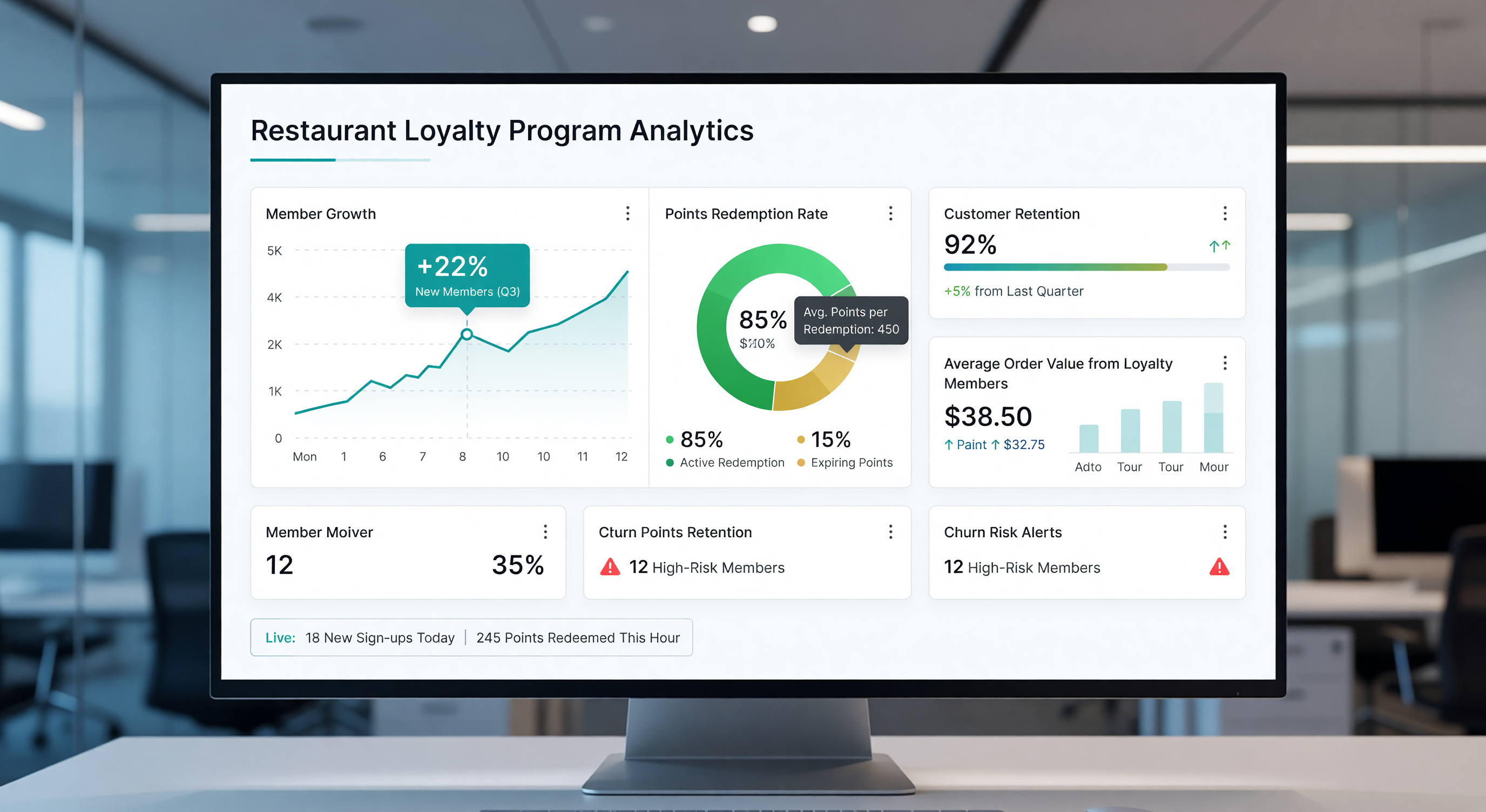
A loyalty program with a poorly designed dashboard is, in practical terms, a loyalty program no one is managing. The vendor-provided reporting interfaces that ship with most platforms tend to overweight enrollment counts and underweight the metrics that actually predict program health. This piece lays out the metrics a useful restaurant loyalty analytics dashboard should display, organized roughly in the order a program manager should look at them each week.
Headline health metrics
The top of the dashboard should display, at a glance, the five metrics that tell you whether the program is healthy this week:
- Active member percentage. What share of enrolled members visited in the past 90 days?
- Redemption rate. What share of issued rewards have been redeemed before expiration?
- Visit frequency lift. How much more often do active members visit compared to baseline?
- Revenue per active member. What is the rolling 12-month revenue contribution per active member?
- Member share of revenue. What percent of total brand revenue comes from loyalty members?
These five together give a faster read on program health than any number of secondary metrics. If any one of them is trending in the wrong direction, it usually shows up here before it shows up anywhere else.
Enrollment funnel detail
Below the headline metrics, the dashboard should display the enrollment funnel:
- New enrollments in the period
- Source of enrollment (in-store, mobile, web, partner)
- Days to first earning visit
- Days to first reward
- 90-day active rate by cohort
The cohort view matters most. New enrollment volume is interesting but secondary; what matters is whether each new cohort of members is engaging at rates comparable to or better than prior cohorts.
Reward economics
The reward economics section should show:
- Reward issuance volume by reward type
- Redemption rate by reward type
- Average discount value per redeemed check
- Point or reward liability outstanding
- Breakage rate (rewards that expire unredeemed)
Liability tracking is particularly important for any program with a point bank that does not expire quickly. Outstanding liability that grows faster than program revenue is a signal of structural design problems that need to be addressed before they become finance issues.
Member segment performance
The dashboard should display behavior by member segment:
- Visit frequency by tier or RFM bucket
- Revenue contribution by segment
- Email and push engagement by segment
- Reactivation rate among at-risk members
For more on how to think about segmentation specifically, see our segmentation overview.
Channel and digital engagement
For programs with a mobile app, the dashboard should show:
- App download rate among new members
- Mobile order share of member transactions
- Push notification opt-in rate
- Active mobile member percentage versus card-only percentage
The gap between mobile-engaged and card-only member behavior is one of the most consistent leading indicators of program quality. A widening gap means mobile is working as a high-value channel; a narrowing gap may mean mobile is underdelivering.
How to use the dashboard
A useful dashboard is one the program manager actually opens weekly. The discipline is:
- Weekly: review headline metrics and flag any directional changes
- Monthly: review cohort and segment performance, identify the one or two segments that need targeted action
- Quarterly: review reward economics and liability, adjust earn or expiration rules if needed
- Annually: review the full year against the goals set in the program roadmap and revise targets for the next year
Programs that maintain this cadence consistently outperform programs where dashboard review happens reactively in response to leadership questions. For an annual structured review, our loyalty program tune-up guide provides a complete checklist.
FAQ
What is the single most important metric on a loyalty analytics dashboard? Active member percentage. It captures the combined effect of enrollment quality, engagement design, and communication effectiveness in a single number.
How often should a program manager review the dashboard? Weekly for headline metrics, monthly for cohort and segment detail, quarterly for reward economics, and annually for full program review.
Why does point liability need to be tracked separately? Outstanding point liability represents a financial obligation that grows over time if earning outpaces redemption. Tracking it lets the program manager catch design problems before they become finance issues.
Further Reading from Authoritative Sources
- Association of National Advertisers — ANA publishes loyalty program measurement frameworks and analytics standards that provide the industry benchmark context for the five headline metrics, enrollment funnel KPIs, and reward economics tracking recommended in this dashboard design guide.
- National Retail Federation — NRF publishes the industry research on loyalty program performance metrics that provides the benchmark ranges operators use to evaluate whether their own dashboard numbers indicate a healthy program or signal underlying design problems requiring intervention.